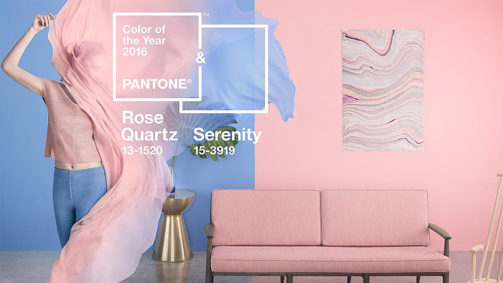
And the Pantone color of the year is… ummm….wait a minute. Pantone was not able to zero down on one color it seems. So we have 2 Pantone colors of the year for 2016 – Rose Quartz and Serenity – shades of Pink and Blue respectively. Here is my take on decorating with rose quartz and serenity.
While both the colors are elegant and sophisticated, no doubt, but I cannot say I was very excited about the prospect of decorating with them. They did not seem capable of creating the thrill that sexy Marsala possessed. But as I began to play around with little touches of both Rose Quartz and Serenity, I started seeing a pleasant transformation in the room. Here is my first attempt at marrying the two lovely colors.
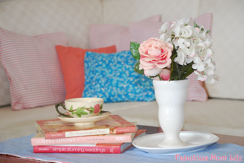
Unlike the many decor inspirations you will find online, I do not do anything as drastic as painting over a wall. If I love a color very much, I might buy curtains and bed linen. Other than that, I mostly use what I have on hand. My only recent purchase for the above arrangement is the pink striped and blue floral cushion covers from Divine Casa-CURL UP.
I gathered together other stuff in the two prominent shades – my whitewashed denim blue table runner turned out to be an exact match for Serenity. I have silk flowers in almost every shade so I was sure to find something there. My China closet and my enormous book collection never fail me either.
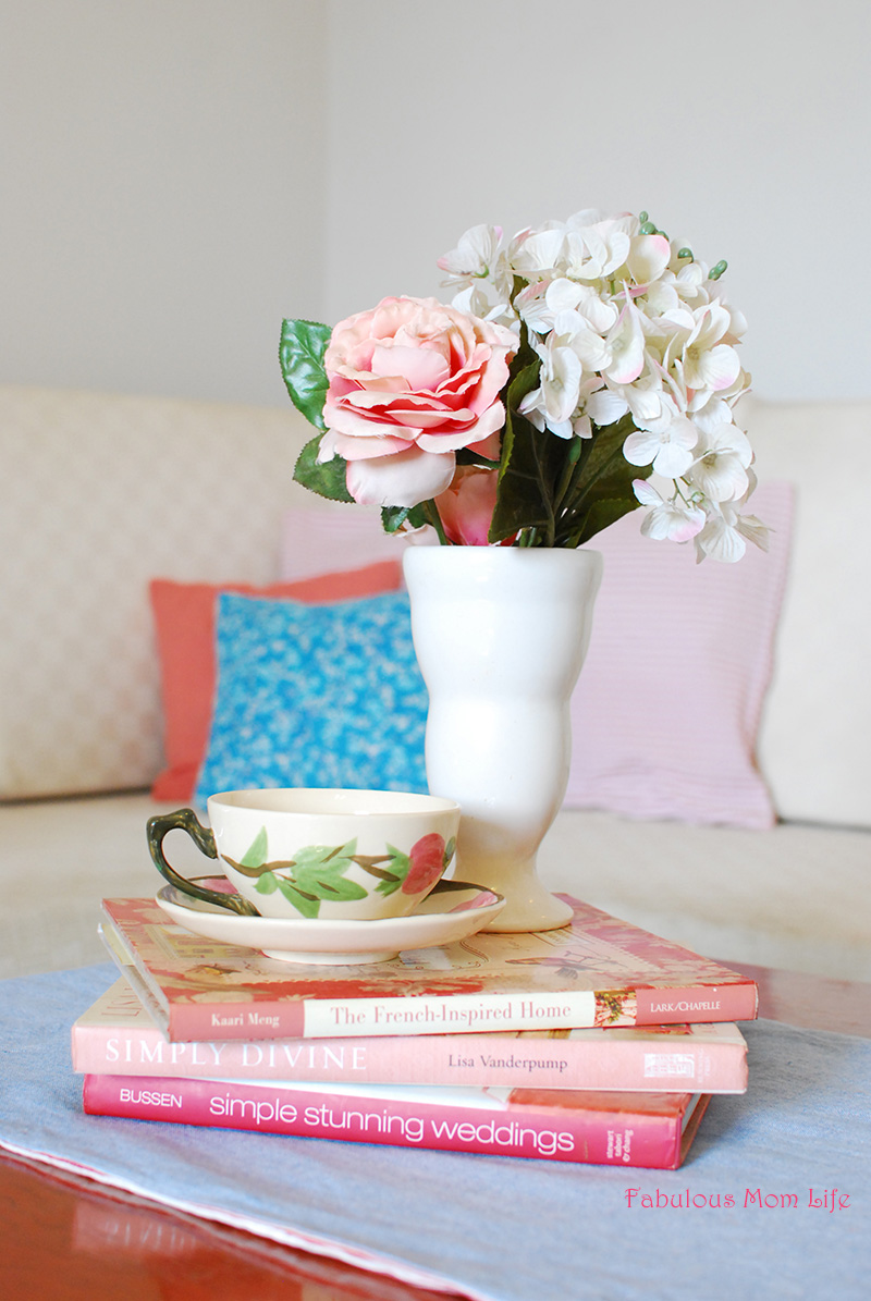
What seemed like it would turn into decor for my little girl’s cupcake decorating party (which I did in pink and blue hues a couple of years back) came out really beautiful and soothing. The vintage candy pink that Rose Quartz is, blends beautifully with the sophisticated light blue of Serenity.
What do you think about Pantone’s colors of the year?

Leave a Reply